It is time the Australian Bureau of Statistics changed the way it reported unemployment figures, writes Alan Austin. Australia’s real unemployment rate is closer to 13% than 7%.
It might be time for the unemployment rate published by Australia’s Bureau of Statistics (ABS) to be put out to pasture. Like a faithful old Clydesdale that has ploughed paddocks and carted hay for decades, the unemployment rate has been put to some demanding tasks. While it has been replaced by the steam engine that is Roy Morgan’s real unemployment rate, we may need to consider other alternatives altogether.
Because it also depends on what we wish to achieve.
Neither of the two most oft-quoted measures of Australia’s jobless – the ABS and Roy Morgan – is satisfactory today. The ABS rate, currently at 7%, understates the level in several ways. It counts only those actively seeking work in the four weeks up to the reference week and only if they were available that week. It regards as employed anyone working as little as one hour a week, even if that one hour was without pay in a family business.
The October data shows 747,600 Australians worked between one and nine hours, which is 5.8% of all workers with jobs. If all of these workers were classified as unemployed – which many effectively are, especially those who only worked a handful of hours a week, the unemployment rate jumps from 7.00% to 12.44%.
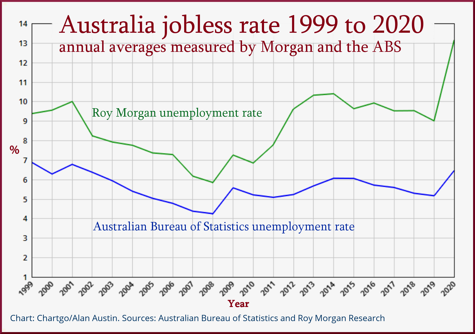
This is why some analysts prefer Roy Morgan’s methodology, which includes a much wider group, and which records the jobless currently at 12.8%.
Both the ABS and RM jobless rates allow comparisons within Australia over time. The ABS data goes back to 1978, RM just to 1999. Both reveal parallel shifts through most of the last 22 years, with RM showing much higher rates. See white chart, below.

Global comparisons essential
The major drawback with Roy Morgan’s data is that it is not comparable with other countries. The ABS jobless rate, in contrast, applies the methodology adopted by the International Conferences of Labour Statisticians (ICLS) and the Organisation for Economic Cooperation and Development (OECD). This ensures jobless measures are as similar as possible across all 37 OECD member countries and beyond.
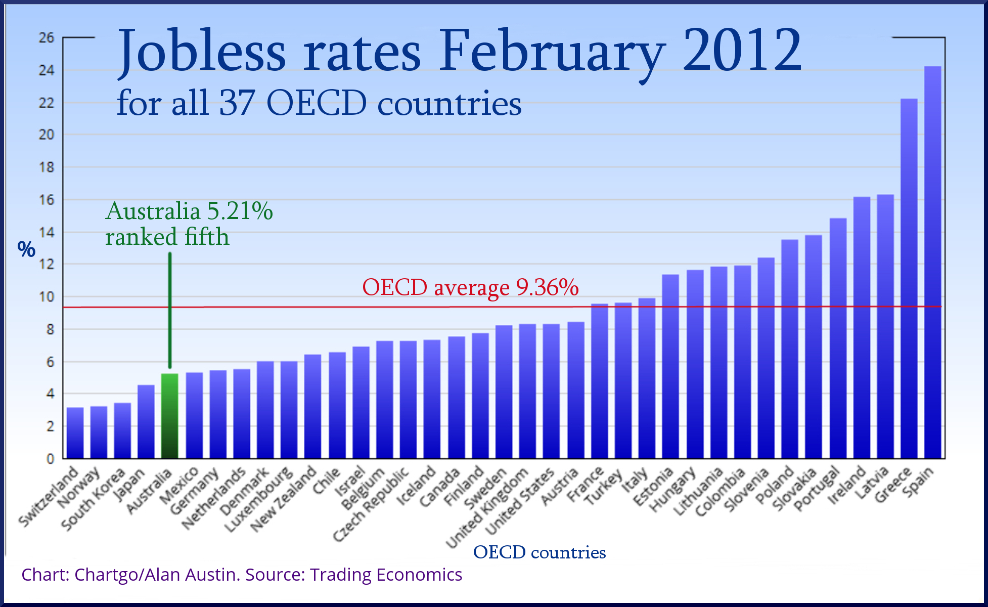
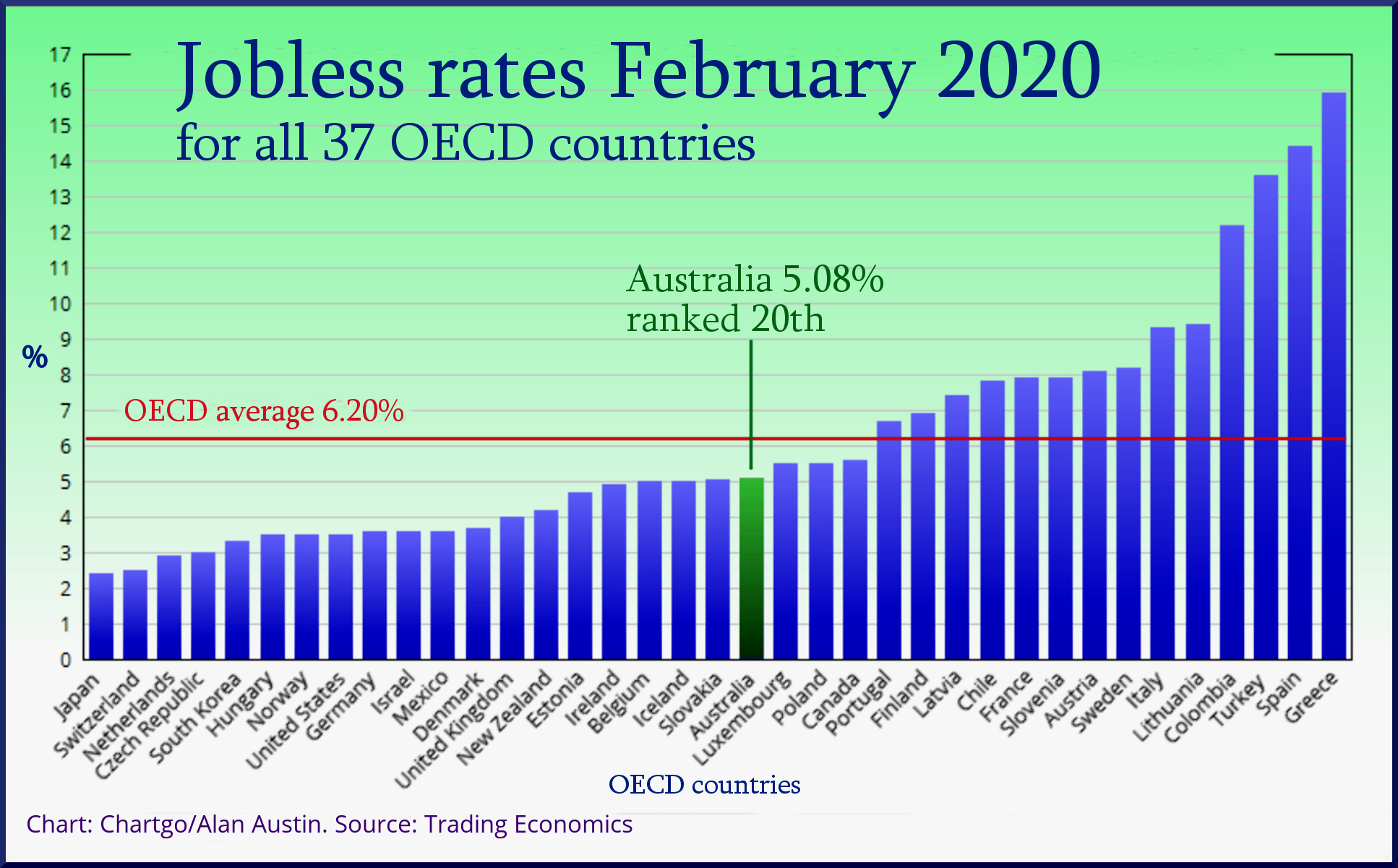
It is critical that global comparisons are readily available. Here’s why. Back in February 2012, Australia’s jobless rate was 5.21%. Eight years later, in February 2020, the rate was slightly lower at 5.08%.
Some observers might compare those figures and conclude that by virtue of the lower unemployment number the economy was better-managed in 2020 than in 2012. They would be wrong. 2012 was near the end of the worst global recession in eighty years. Most countries were emerging from devastating job losses. A rate of 5.21% was evidence of exceptionally sound economic management, ranking fifth in the OECD and close to half the OECD average. See blue chart.

The global climate had completely changed by 2020, with the whole world having enjoyed a solid six-year boom in investment, exports, jobs and corporate profits.
Thus, 5.08% in 2020 was a pretty average outcome, down in the bottom half of the OECD table, nowhere near the global leaders. See green graph, below.
Without data from comparable countries, it is not possible to see Australia’s outcomes in the global context. It is a feature of economic reporting by Australia’s mainstream media that global comparisons are seldom, if ever, made.
They should be. These are Australia’s OECD rankings on the ABS/ICLS unemployment rates in December of each year over recent decades:
1991: 28th
1992: 30th
1993: 26th
1994: 25th
1995: 19th
1996: 20th
1997: 19th
1998: 18th
1999: 15th
2000: 17th
2001: 20th
2002: 19th
2003: 15th
2004: 13th
2005: 12th
2006: 12th
2007: 12th
2008: 11th
2009: 7th
2010: 3rd
2011: 6th
2012: 7th
2013: 12th
2014: 13th
2015: 14th
2016: 14th
2017: 20th
2018: 19th
2019: 19th
Alternative employment measures
So are there better measures of progress in providing livelihoods for the citizenry? Yes, there are. Instead of measuring people who work no hours at all, we can measure those who do have work. The ABS provides this data. It just has to be presented in an accessible way.
Workers with full-time jobs
The ABS gives us the number of employees who consider themselves working full-time, even when weekly hours are below 38. We also have the total adult population.
By dividing the former by the latter we can get a neat measure of the economy’s capacity to provide jobs – the percentage of the adult population in full-time work. This is a positive indicator of good outcomes rather than undesirable outcomes.
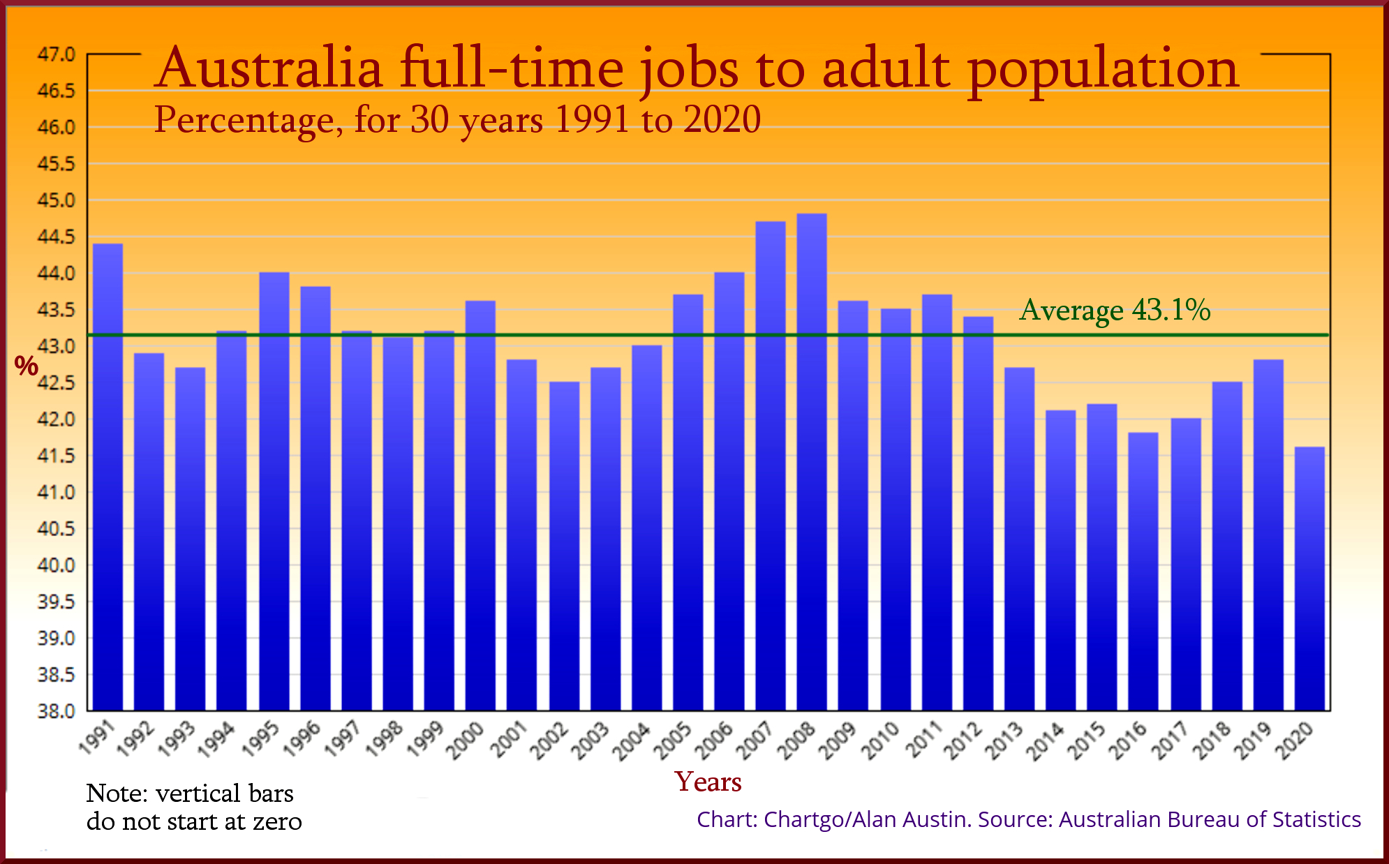
The latest figures show that in October, 8,643,700 Australians had full-time jobs. That was 41.4 % of the population over 15 years of age. This can easily be compared with past periods, going back to 1978. When we do this, we can readily see which periods employed the most full-time workers relative to population, and hence which economic policies were most successful. See yellow graph, below.

The chart shows that this measure dipped below 43 hours during the early 90s and early 2000s recessions, but stayed well above during the global financial crisis. We also see that six of the past seven years have been the lowest on record. (This chart shows only the past 30 years; all previous years going back to 1978 were higher than 45.0.)
Global comparisons possible
It is easy with this measure to compare Australia’s outcomes with the rest of the world and to track this over time. The number of people employed is published regularly by more than one hundred countries, including all OECD members, and available here at Trading Economics.
Until the current ABS jobless rate draught horse is replaced by a globally acceptable alternative, those wishing to keep updated can do so via the datasets referred to here. Together they yield a pretty reasonable crop of information.
Will the passage from JobKeeper to JobMaker finish at JobSeeker?
Alan Austin is a freelance journalist with interests in news media, religious affairs and economic and social issues.

